Scenebrook Unveils New Logo

Hi all,
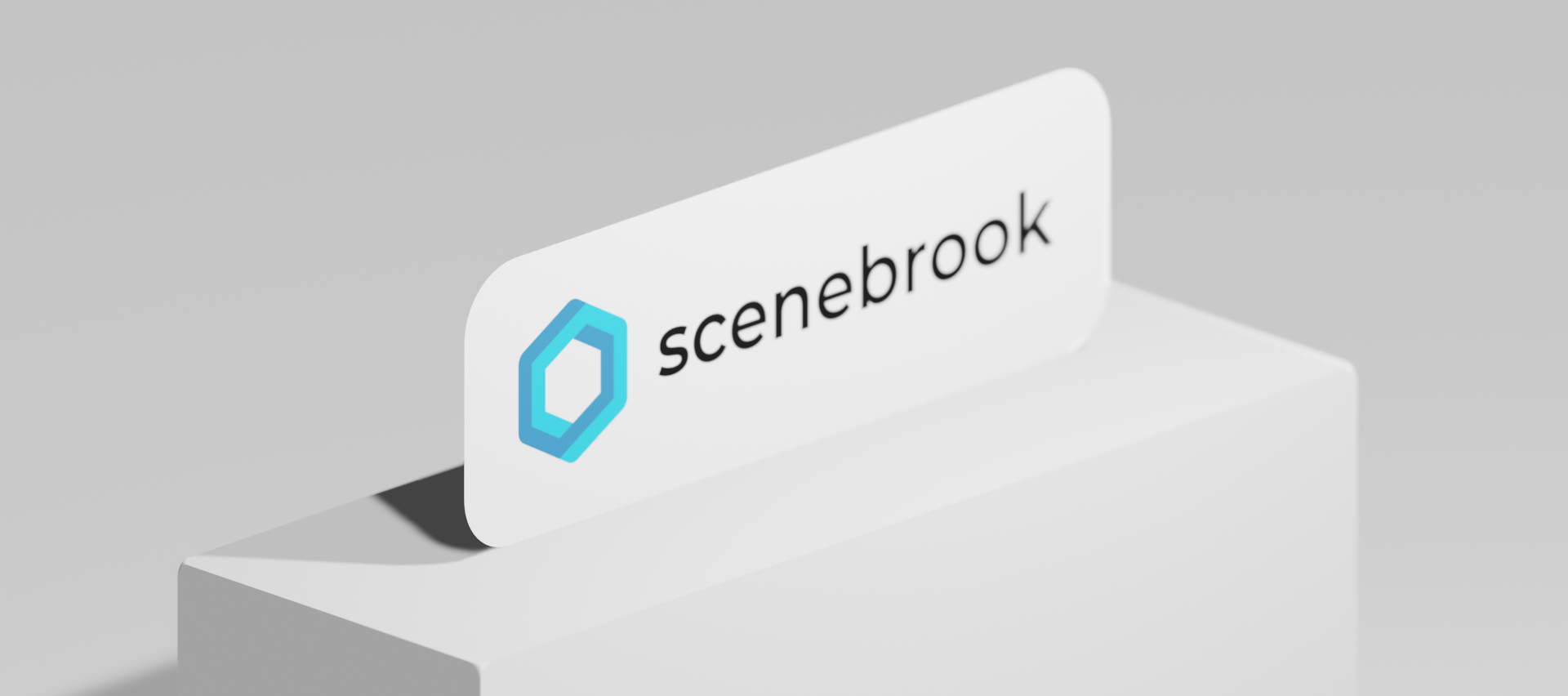
At Tellick, we're always looking for ways to improve our platforms and make it more accessible and user-friendly for everyone. Today, we're excited to announce the launch of the brand new logo for Scenebrook, which represents the next step in the product's evolution.
The new logo is a sleek and modern design that incorporates elements of our original logo while giving it a fresh and updated look. We've also chosen a new color theme that is vibrant and eye-catching, with shades of blue that reflect the immersive nature of our virtual reality experiences.
In addition to our new logo and color theme, we also chose to incorporate the hexagon shape into our branding. The hexagon has special significance for us because it represents the fundamental building block of many natural forms, including the molecular structure of many organic compounds. By using the hexagon as part of our branding, we're highlighting our commitment to creating realistic and engaging virtual experiences that capture the beauty and complexity of the natural world. Not to mention that of course, hexagons are the bestagons.
We believe that this new branding reflects the innovative and forward-thinking nature of our product, and we hope that it will help to attract even more users to our platform. Whether you're an experienced VR creator or just starting out, Scenebrook is the perfect tool for creating, sharing, and experiencing VR content right from your browser.
With our new logo and color theme, we're excited to take Scenebrook to the next level and continue to improve our platform for our users. We can't wait to see what our community will create with our tool, and we look forward to sharing their amazing VR experiences with the world.
Thank you for your support, and we'll see you in the virtual world!
Go to https://scenebrook.com to see the changes for yourself and try out the platform for free.
Dennie from Tellick
